Building the Death Star #1
"Vertical slice" is from the game industry: instead of showing off rough drafts of all the levels, you focus intently on one small section of gameplay. You build it out and polish it up to the point that people can start to sense how it will all feel when it comes together.
To this point in the development process, I've built a couple prototypes that got me excited about the potential. But as I was building the marketing page, it became very clear how hard it is to talk about the app without an actual demo of it. This series will walk through the building of that demo, and I'm going to try and make it a proper vertical slice.
Andor feels like the perfect story to test on. It's 12 episodes, well-structured, strong thematics, reasonably intricate plotting, character-focused, good mix of drama and excitement, and right up our alley here at Potboiler Labs, in the sense that it's way better than it needs to be considering the budget and IP at its disposal. Plus, it tells the story of one of the guys who steals the plans to the Death Star, and sometimes the scope of this project feels like my own personal Death Star, so it's all apropos.
There was an even better reason to choose Andor, by the way -- Tony Gilroy, showrunner, announced his plans to release the shooting scripts for the first season. But then the Writers' Guild went on strike, and that fell by the wayside, so I've got to hack together my own scripts.
Cleaning up SRTs with Subtitle Edit
Subtitle files are freely available, so it's easy enough to grab a set of those. But these need cleanup: subtitles also include sound effects like "(PANTING)", or nearly inaudible background dialogue which only exists to fill out the soundscape.
I downloaded a program called Subtitle Edit and found it to be one of those delightfully useful pieces of freeware you'll stumble across on the internet every now and then. It's inspiring while I'm trying to build something equally useful (tbd on the freeware, though). What makes it so useful is that it's very clearly designed to solve common problems, so just by reading the menus I can learn something about the problem space.
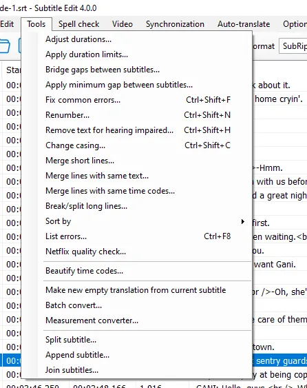
As someone who spends too much of his life digging through menus, a dropdown with a long list of clear, imperative commands fills me with gratitude.
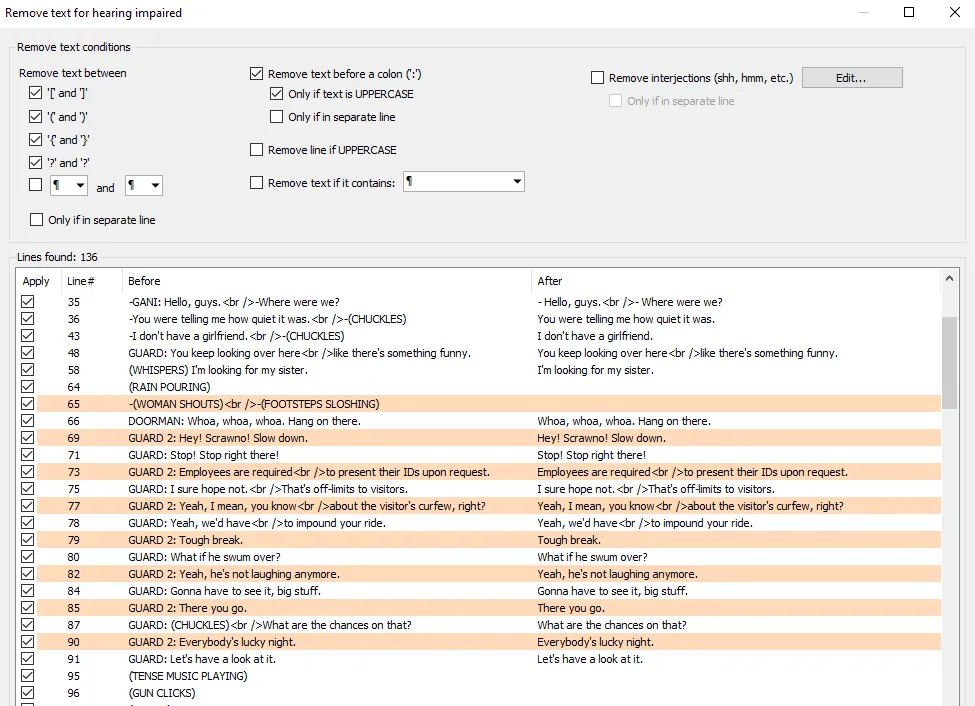
This filters out a lot of the extraneous dialogue.
After that, I did a first pass on merging and splitting the dialogue, so that the text files would look more like a script. The UI for this required more clicking than my carpal tunnels would prefer, though, so I knew I'd have to account for this functionality in phase 2.
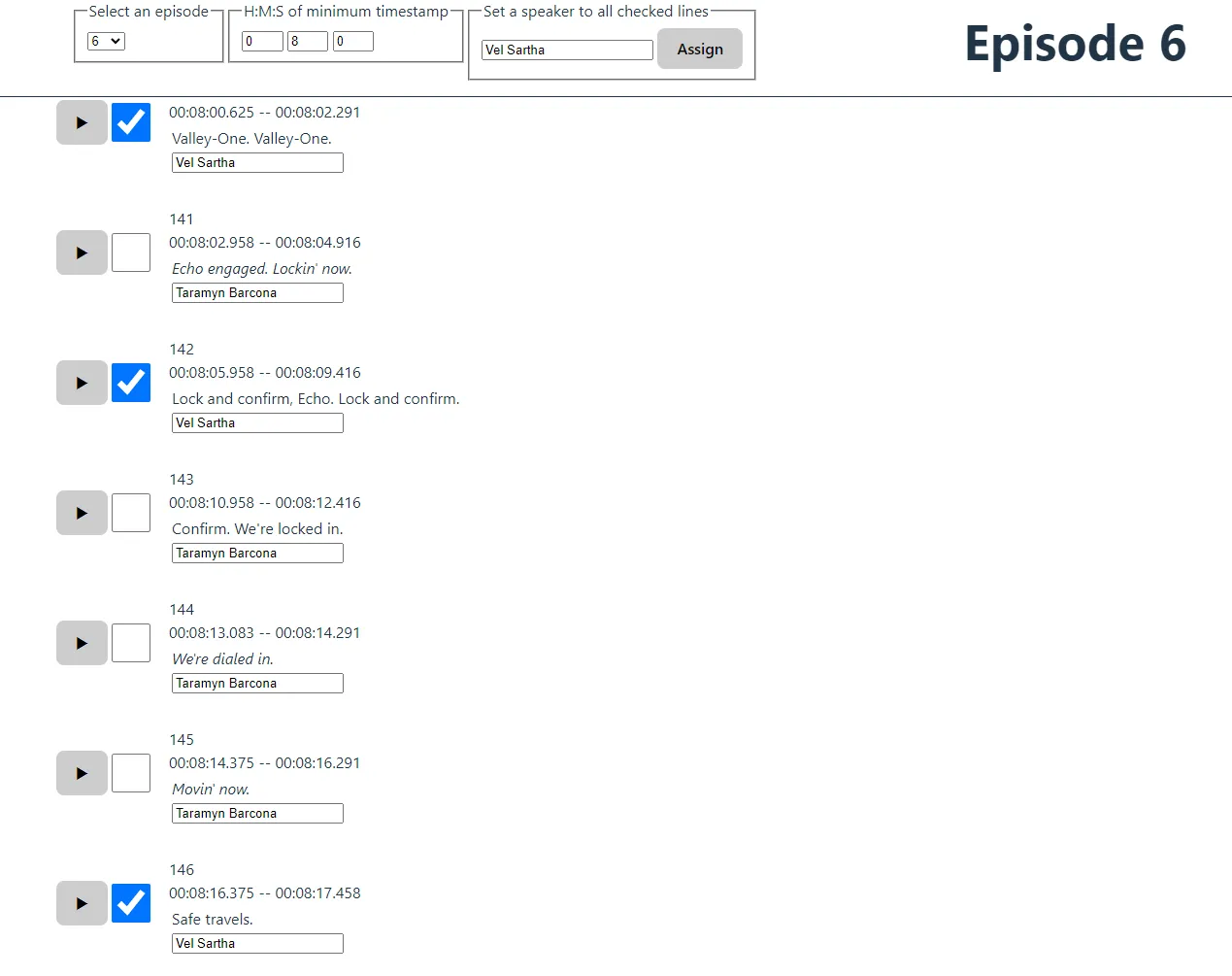
Building a tool to assign speakers
One skill that programmers develop is the ability to make their own tools. Everyone who writes code probably has a natural instinct to automate things whenever possible -- sometimes to our detriment, when the brute force solution would still be faster than tinkering with something purpose-built.
In this case, the brute force solution would probably be dumping everything into a spreadsheet and going from there, but I knew I was going to need the ability to jump backward to catch bits of dialogue I missed. I've also got another personalized tool for managing my painting reference images, and I've built plenty of UX to manage all the tagging there, so I knew the ergonomics would be worth the effort.
So I built a small Svelte app.
These days, when I need to build a JS tool for myself, my rule of
thumb is to pick "anything but React", and it's been a success every
time. Svelte's got two-way data binding, so I could just do the most
straightforward thing at every turn. For instance, when I wanted to
build in some checkboxes to enable bulk-assignment, I didn't need to
hoist a callback to some higher-order component... I just used a DOM
selector to grab the relevant inputs, modified their content, and
triggered their "change" events. This was then dumped into
window.localstorage, and that was that.
The killer feature here was the play button. If I click on that, it will submit an XHR request to my VLC media player, specifying a timestamp to jump to. This lets me loop back if the dialogue gets too fast to keep up with, and proved immensely useful: with this setup, I was able to annotate episodes in realtime, like a court reporter.
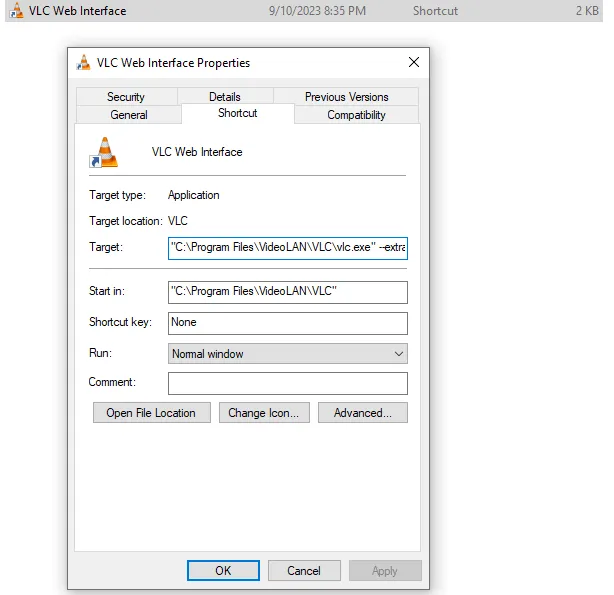
VLC's web API is not the prettiest thing, but since it is another one of those unbelievably useful pieces of freeware, it works. (I have so much confidence in VLC that I instinctively knew it would offer some interoperability with my Javascript frontend.) Here's how I set that up:
-
I'm on Windows, which lets you configure a shortcut that will
accept additional flags. I used this command:
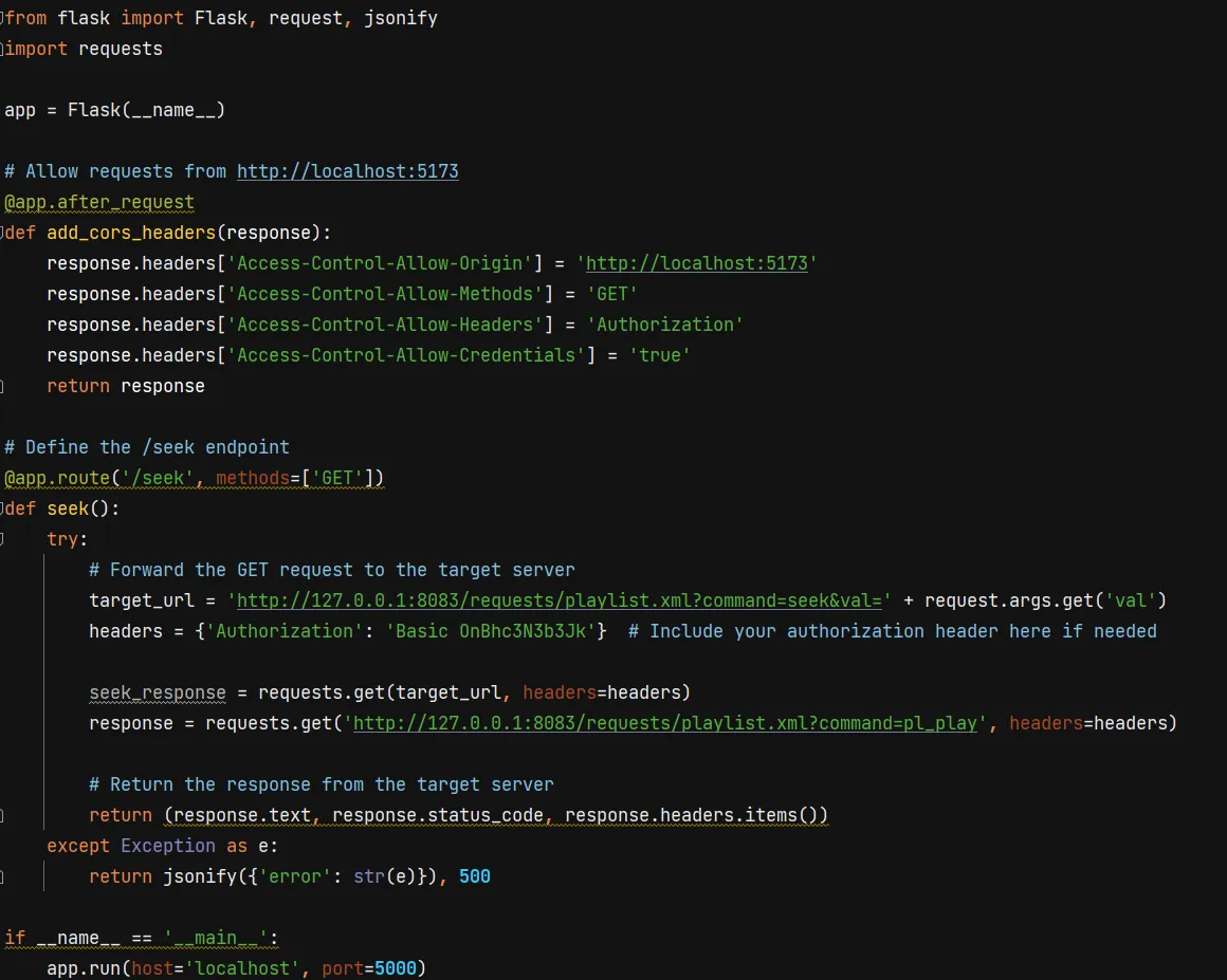
"C:\Program Files\VideoLAN\VLC\vlc.exe" --extraintf=http
                --http-port=8083 --http-password=password
. Launching VLC through this shortcut will enable a tiny web app to control your VLC (running onlocalhost:8083behind basic HTTP authentication in this case), but we don't want to use it -- we just want to submit directly to its endpoint. -
Unfortunately, sending an XHR from
localhost:5173tolocalhost:8083violates CORS. To fix CORS issues, you need to tell the server to accept requests from this other origin, but in this case, I had no clear way to mess with whatever server VLC was running here. So instead of worrying about that, I spun up a reverse proxy in Flask. Its only job was to listen for the XHR request and forward it along to the VLC web app.
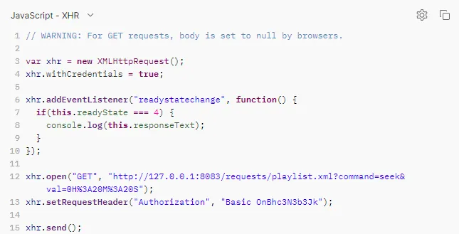
I used Postman to build the XHR request: if you weren't aware, it'll do some codegen for you too.
This is the whole app
I will say this: the second most viral I ever went was when I built a social network of the A Song of Ice and Fire novels. I did a whole machine learning thing to predict the speakers, then combed through and confirmed each labeling by hand. That took ~75 hours for 668,000 words of dialogue, so as far as I'm concerned, 8 hours isn't too bad.
Once I had this all working, it was just a matter of time. Time-intensiveness is on my mind whenever I'm building something for this app. My theory is that, since a novel will take 500-2000 hours to write, even an extra 100 hours of data entry wouldn't be completely intolerable. But tedious data entry will be a killer, even if I'm targeting this to people who are very comfortable at a keyboard. Andor is about 8 hours long, and I was feeling a little stir-crazy at the end of this process, which isn't very encouraging... but I think that's the point of dogfooding. I'm proposing to solve certain pain points for writers: use this app and you won't have to worry so much about keeping track of characters, or missing an obvious narrative opportunity. But my solution brings pain points of its own, namely mind-numbing data entry. Having a strong emotional sense of this even in this earliest stage will give me a good instinct for where to focus my efforts. Anything I can do to reduce friction in that direction will be time well spent.
This work was a satisfying reminder of how good the FOSS ecosystem
is. If you know how to code, you can assemble these ad hoc pipelines
that would be a tremendous annoyance otherwise. For instance, my
naive assumption was that I could just stick the video files into a video tag, but Chrome struggles to seek through files of that size. Instead
of trying to troubleshoot that, I just put my trust in VLC.
Initial Reports
After five days of work, you want to take a second to see what kind of progress you've made. I now have:
If you don't know word counts, 42k puts Andor solidly in the novella range. National Novel Writing Month requires 50,000 words over 30 days, and a 300 page novel is going to be around 100k. Which would suggest that a writer tagging their manuscript would be faced with ~16 hours of data entry right now. Will have to do what I can to pull that number down.
-
A Svelte frontend with the ability to:
- jump between episodes
- filter by timestamp
- tag a chunk of dialogue with metadata
- A way to integrate the source video into this frontend
- A database containing 8,374 tagged lines of dialogue, representing 42,810 words.
Can we pull anything interesting out of our new dataset? Two ideas come to mind:
Minutes Talking
Since .srt files have very precise timestamps, we can easily
figure out how many minutes each actor gets to talk.
| Character | Minutes of speech |
|---|---|
| Cassian Andor | 35.05 |
| Luthen Rael | 27.46 |
| Dedra Meero | 21.92 |
| Mon Mothma | 17.64 |
| Vel Sartha | 13.90 |
| Karis Nemik | 13.16 |
| Kino Loy | 11.57 |
| Syril Karn | 10.78 |
| Maarva Andor | 10.78 |
| Sergeant Linus Mosk | 9.93 |
| Major Partagaz | 8.65 |
| Arvel Skeen | 6.84 |
| Bix Caleen | 6.51 |
| Lieutenant Supervisor Blevin | 5.70 |
| Lieutenant Gorn | 5.66 |
| Taramyn Barcona | 5.59 |
| Commandant Jayhold Beehaz | 5.42 |
| Eedy Karn | 5.07 |
| Brasso | 4.75 |
| Tay Kolma | 4.29 |
| Colonel Yularen | 4.19 |
| Imperial CO | 3.94 |
| Kleya Marki | 3.93 |
| Perrin Fertha | 3.84 |
| Chief Hyne | 3.60 |
| Davo Sculdun | 3.47 |
| Supervisor Lonni Jung | 3.28 |
| Jemboc | 3.25 |
| Saw Gerrera | 3.13 |
| Pegla | 2.97 |
| Doctor Gorst | 2.96 |
| B2EMO | 2.92 |
| Willi | 2.68 |
| Prisoner | 2.59 |
| Cinta Kaz | 2.58 |
| Clem Andor | 2.52 |
| Narkina PA | 2.41 |
| Captain Vanis Tigo | 2.41 |
| Attendant Heert | 1.99 |
| Xanwan | 1.97 |
| Lieutenant Keysax | 1.95 |
| Melshi | 1.91 |
| Nurchi | 1.79 |
| Kravas | 1.61 |
| Corv | 1.49 |
| Intake Warden | 1.47 |
| Captain Elk | 1.44 |
| Timm Karlo | 1.40 |
| Leida | 1.31 |
| Hostess | 1.31 |
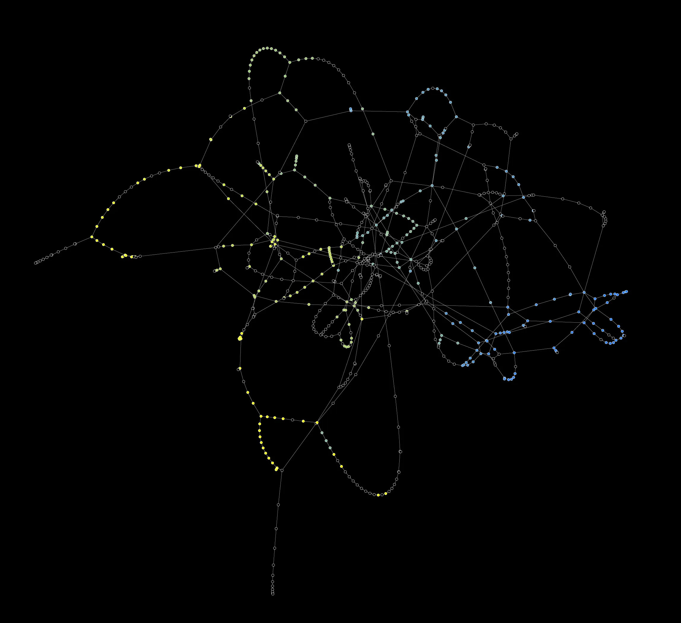
Dialogue Maps
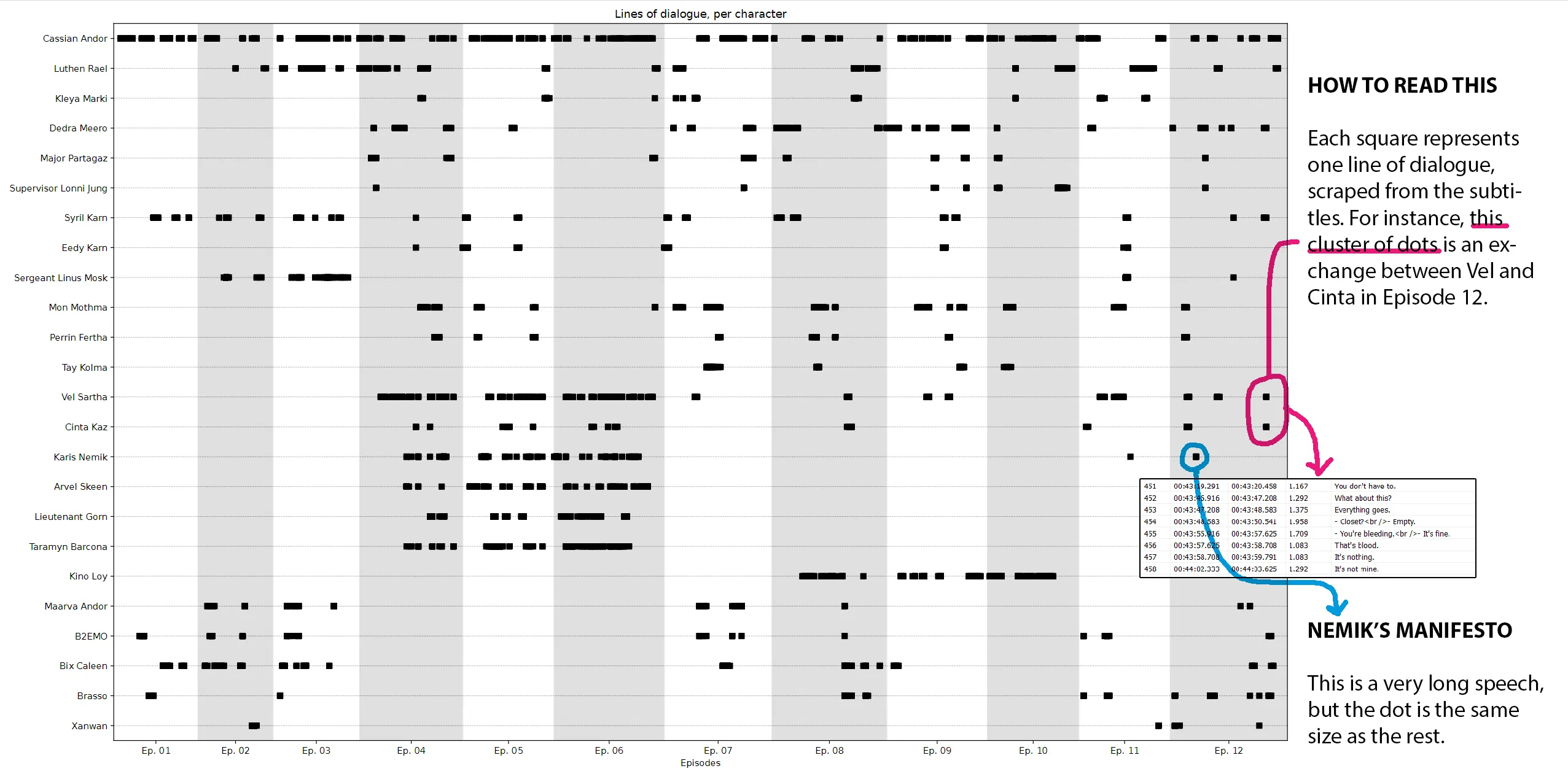
I've been interested in "distant reading" since 2007, so I've built this kind of visualization before. It's fun to look at, but not real helpful for a writer. Couple things I'll say in its favor:
- It's interesting to think of these parts like instrument sections in an orchestra. Cassian is a steady drumbeat, running throughout. Syril is, I don't know, a bassoon? who gets a nice solo in the first movement, but gets sidelined as a result of his failure on Ferrix. There's less for him to do at this point, but the writers still want him involved in the finale, so they diligently check in with him -- typically early in the episode -- just to keep him fresh in our minds.
- Seems like there's a tendency to cluster a character's scenes within an episode. Again, check out Syril's timeline. In episodes 7, 8, and 9, he'll have a scene, we cut to some other characters for one scene, and then we cut right back to Syril for a capper.
- I paired up satellite characters with their main character: you can see how Kleya Marki, B2EMO, and Eedy Karn serve as supports for Luthen, Maarva, and Syril, respectively. TV demands these types of characters, since we can't read minds. Literature doesn't have that constraint, and I bet that has informed the construction of every novel ever written.
- Long, unbroken lines are interesting: Vel, Gorn, Taramyn, Kino, and Sgt. Mosk really get to take over the screen for big chunks of episodes. Compare that to Mon Mothma, who's such a crucial part of the story but never gets to dribble the ball for that long.
Here are some improvements I'll work on next:
- Social network view, showing conversational partners. If you know the show and are willing to squint, you can figure out that Cassian and Luthen only have three scenes together, but that can be made much clearer with a graph view. To create that, I'll need to annotate each conversation to see who is being addressed with each line of dialogue. I also realized that eavesdroppers are good to keep track of: in a spy show like Andor, the sometimes asymmetric flow of information is all part of the fun.
- Think about how to represent non-verbal actions. Obviously a script will have action beats written out -- how should we add those?
- Integrate plot points, like the Aldhani heist. I imagine that key events will make some of the activity more legible.
- Start to qualify each line of dialogue. Not all of those boxes are created equal: Nemik's big manifesto or Maarva's big speech take up minutes of screentime, and you wouldn't know it from here.
- Similarly, most of the Aldhani crew gets tons of dialogue, but a lot of it is bank robber stuff: "Move! On the ground! Open that door!", etc. That makes it hard to see the big, dramatically significant moments.
- We need better ways of showing simultaneous action. I think the shape of this visualization is right -- it looks like a video timeline editor, and I think that track mentality is good. Just need to make it easier to work with.